Pantone’s Top 10 Spring 2017 Colors Counts on New York Fashion Week for Inspiration
Niagara, Primrose Yellow, Lapis Blue, Flame and Island Paradise were the leading five spring colors based on Pantone's analysis of New York designers' spring runway collections.
By Rosemary Feitelberg on September 19, 2016
 VIEW GALLERY — 10 PHOTOS


In keeping with the see-now-buy-now undercurrent sweeping through the spring collections, Pantone has switched up its seasonal forecasting by releasing its Top 10 colors in the wake of New York Fashion Week.
Leading the charge are Niagara, Primrose Yellow and Lapis Blue in the top three slots respectively, followed by Flame and Island Paradise. Ranking sixth through 10th, are Pale Dogwood, Greenery, Pink Yarrow, Kale and Hazelnut.
Just as many designers have taken to a more immediate approach to retail, so has Pantone with its color analysis. Pantone Color Institute’s executive director Leatrice Eiseman said, “Obviously, that’s a really important part of where the fashion industry is headed. You have to look at things and ask would people say, ‘I love that color. I want it now.’ For us, it also plays into that whole idea of transitional seasons and offering options that are not just typical of seasons.”
True to the itinerant nature of today’s jobs, Eiseman tuned into the New York runways from Seattle and Paris. With some designers like Thom Browne blending nine shades into one dress (not counting the Island Paradise lipstick worn by some of his models), the Pantone team had their work cut out for them. There were about 119 NYFW shows and presentations on the schedule, with colors ranging from “the wackadoodle to the absolutely gorgeous and romantic,” Eiseman said. Relying on the numerical and the instinctive, she said, “When you’re seeing the colors and the clothing coming down the runway, you get a pretty good picture of what value the color is and what tonality it is…. We also record them. In the end, it really is a question of numbers — how many people are using these variations of colors.
“We looked at each look, and of course for that, you really have to whistle through. But there are certain things that stood out because we’re always looking for color cues,” Eiseman said. “It seems to me that exponentially it just gets better and better, because there is just so much originality and freedom in the use of color, particularly in the use of combinations. It’s fun for us to see the extremes too — from the silly to the sublime. And silly in a good way because it can also be inventive, creative and eye catching. You look at all the gorgeous dresses, gowns and fabrics and that’s all lovely. But when there’s whimsy as well that puts a smile on your face, that’s what fashion is all about.”
PANTONE FASHION COLOR REPORT SPRING 2017
Niagara 17-4123
Comfortable, dependable and relaxed, this denimlike blue was used by Carolina Herrera for a ballgown, by Zac Posen in translucent detail on a gown and by Joseph Altuzarra in a floral-printed denim jacket. “That convergence of different looks coming together was a standout to me,” Eiseman said. “One of the things that really impressed me was the Carolina Herrera dress shown in this denimlike blue — the bustier effect in this denimlike color. The creativity involved in that was kind of like denim-meets-ballgown.”
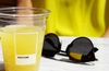
Primrose Yellow 13-0755
Along with several of the other Top 10 colors, this sunlight one is akin to flowers and a reminder of nature. Several designers used this color with the cooler Island Paradise and warming Hazelnut, Eiseman said.
Lapis Blue 19-4045
When it comes to blues, navy is a given as a spring color. Lapis Blue is a way of bringing in a bit more vitality, adding a little more energy with an inner radiance or pearlescence that enhances any layering effect, from Eiseman’s point of view. “That’s the direction we’re heading in with the blues — not to stay too boring or too same,” she said. “Blues are anchoring colors. Women are looking for change, they’re looking for fun or some drama in fashion. But those familiar colors give us some ease in a political climate that gives us reason to calm down a bit.”
Flame 17-1462
This red-fused orange definitely has a lot of heat in it and is “gregarious, vivacious and definitely a party color. It’s very theatrical and you know you’re definitely going to turn heads when you wear that color and walk into a room.” Rag & Bone, Gabriela Hearst and Lela Rose were onto it, Eiseman said. “Tory Burch has a history of loving that color and she does it very well.”
Island Paradise 14-4620
A refreshing cool blue, this shade found its way into Victoria Beckham’s panne velvet dresses and the color alone made one feel it was spring, Eiseman said. Its name alone brings to mind beautiful bodies of water that make daydreamers want to dive right in, she added. Lela Rose earned her praise for using the hue in a lace dress as did Christian Siriano for combining the light blue with fiery Flame.
Pale Dogwood 13-1404
Color watchers might see this one as an extension of Rose Quartz, which shared the 2016 Color of Year title with Serenity. “There is a holdover effect — people are still affected by it. Designers are working in a season where they’re thinking of lightness and airiness,” Eiseman said. J.Mendel, Banana Republic, Ryan Roche, Baja East and Lacoste looked to have gotten the cue and others added it to Kale.
Greenery 15-0343
Shoppers’ longing for the great outdoors is evident in this yellow-green and its partner Kale. Zac Posen, Trina Turk and Cynthia Rowley all had a dose of Greenery. “The Japanese have a technique called ‘forest bathing,’ where they encourage people to go outside and take a walk in a forest. Obviously, if you live in a big city you don’t always have that opportunity. But anything that you can create that gives you that feeling of really being immersed in nature is a good thing,” Eiseman said. “Greens are not unknown to Michael Kors, but he was right on target with the way he used this, along with Island Paradise and Lapis Blue.”
Pink Yarrow 17-2034
Festive and visible, this is a color women know well since it has been an outstanding cosmetics color for years. “Put it in a garment and you’re always going to get compliments,” Eiseman said. Kith and Nanette Lepore seemed to have gotten the memo.
Kale 18-0107
Apparently, this leafy green’s popularity extends beyond juice bars, restaurants and farmer’s markets. Aside from complementing so many other colors, Eiseman said, “We refer to it as ‘oxygenating,’ taking a breath of fresh air. The world of architecture is also in on the trend given the breadth of vertical gardens, rooftop greenery and leafy plazas cropping up in new commercial buildings from New York to Dubai. “They’re bringing plants in but not just plunking them down in your office. Architects are really turning it into an art form whether you are in a work atmosphere, a hotel or theater — anywhere you really want to bring the outside in,” she added.
Hazelnut 14-1315
A quintessential neutral with a warm undertone, Hazelnut speaks to the idea of transitional color that actually can be worn all year, Eiseman said. Kanye West used it in his controversial Yeezy collection and Dennis Basso worked it into a chiffon blouse and a short lace dress.